Platform Onboarding Redesign for Teyk
Teyk is a Hong Kong-based fintech startup on a mission to make investing simple and hassle-free. I joined the company in 2022 as the solo product designer. I worked on the platform from 0 to 100, redesigning the entire app from the onboarding process to the investment dashboard.
Task
Transform onboarding by gathering data and user research with a cohesive brand refresh and a simplified mobile and desktop redesign to build trust and ensure seamless platform entry.Role
Product Design, Design SystemTeam
Meroko Kwong, Lee Wilkins, Tim Jones
Problem

No visibility and clear roadmap of onboarding.
The KYC process lacked a clear timeline, leaving users unsure about how many steps remained or when they’d complete the process.
Impact📊 20 days average to get bank connected.

Overloaded screens with not enough focus.
The confirmation page, meant for plan review, includes an affordability check - users can't proceed with "unaffordable" score.
Impact📊 45% drop off rate.

No feedback after the required $10K transfer.
At the end of the transfer process, users receive no confirmation or next steps, leaving them unsure if the transaction was successful.
Impact📊 31% of CS inquiries were about $10k deposit.

Intimidating financial concepts.
To simplify risk levels, we introduced “short-term risk”, but users couldn't make the connection to how it affected their investments.
Impact📊 50% misunderstood “short term risk”.
How might we make the daunting task of investing more approachable, ensuring users feel informed and empowered to begin?
Goals
Increase user retention
Streamline the onboarding experience to make investing approachable, reducing friction and boosting user confidence.
Build trust and brand loyalty
Providing clear and empowering guidance throughout the investment journey establishes Teyk as a trustworthy brand.
Clarify the investment process
Clearly differentiate portfolio options, outline the investment timeline, and provide easy steps for users to link their bank accounts.
Enhance consistency
To ensure a proper design system is in place to reduce technical debt, and give our consumers a better, consistent experience.
Our Users
Before we started designing, we conducted a series of customer interviews. We focused on identifying what is the job that our customers hire our product for. We defined 3 user archetypes, and mapped them to their respective jobs-to-be-done.

Tech-Savvy Terry
Terry is a young professional who embraces technology and enjoys learning about new financial tools. She values efficiency, personalization, and the ability to control her investment decisions.
Jobs-to-be-done"I want an onboarding process that feels intuitive and smooth, like how my other mobile apps work. I need to be able to differentiate the portfolio options at a glance so I can hit the ground running and invest without delays."

Cautious Carla
Carla is a risk-averse professional who values clarity and reassurance when making financial decisions. She needs a simple platform that guides her through the investment process without overwhelming her.
Jobs-to-be-done"I need an onboarding experience that walks me through every step of the way—whether it’s filling out my KYC, understanding my bank connection, or setting up my investment plan. I want a clear sense of security before moving forward, with plenty of guidance to make me feel confident."

Busy Ben
Ben is a busy professional who seeks financial growth but has limited time to manage investments. He wants a quick, efficient process that doesn’t require extensive effort or deep research.
Jobs-to-be-done"I need a quick and efficient onboarding process that doesn’t take up too much of my time. I want to easily complete the KYC process, connect my bank account, and set up my plan—all without having to dive into complicated steps. I need it fast so I can focus on other things."
Strategise and Design

I sketched multiple user flows to visualize and communicate ideas quickly to key stakeholders. My focus at this stage is to iterate quickly while keeping in mind our tight timeline and limited resources. I made sure to adhere to our two constraints: keeping our backend changes to a minimal, and new designs should align with existing components while maximising impact to maintain visual cohesion and minimize development time. Here are some early sketches of the Plan page.
Stepper Timeline
This stepper timeline was an early experiment to make the onboarding process clearer for users. We aimed to keep things simple, while still giving enough details so users knew what to expect—without overwhelming them, even when regulatory texts made things longer.

Investment Risk aka 'Short Term Risk'
We tried to make investment risk feel simpler by using the term "short term risk," but it ended up confusing users more. The goal was to make risk less intimidating, and allow users to change their selection only when needed, but this term made things more complicated instead.
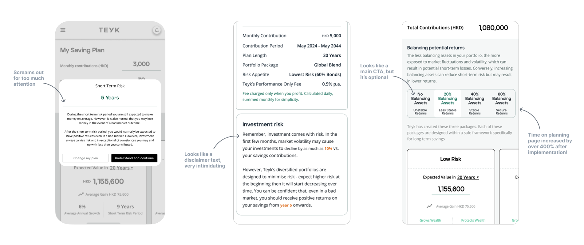
We went through 100 iterations
Despite having a small product team, we continuously refined the design by incorporating feedback from customer inquiries and Mixpanel data to ensure it was intuitive, scalable, and adaptable for future growth.
I wish I could show you every single part of the process!
Usability Testing & Customer Interviews
To validate our designs, I conducted remote user interviews with 5 of our alpha users during the pandemic. After gathering all the insights, I consolidated the findings and shared my suggestions with the team to inform our next steps.

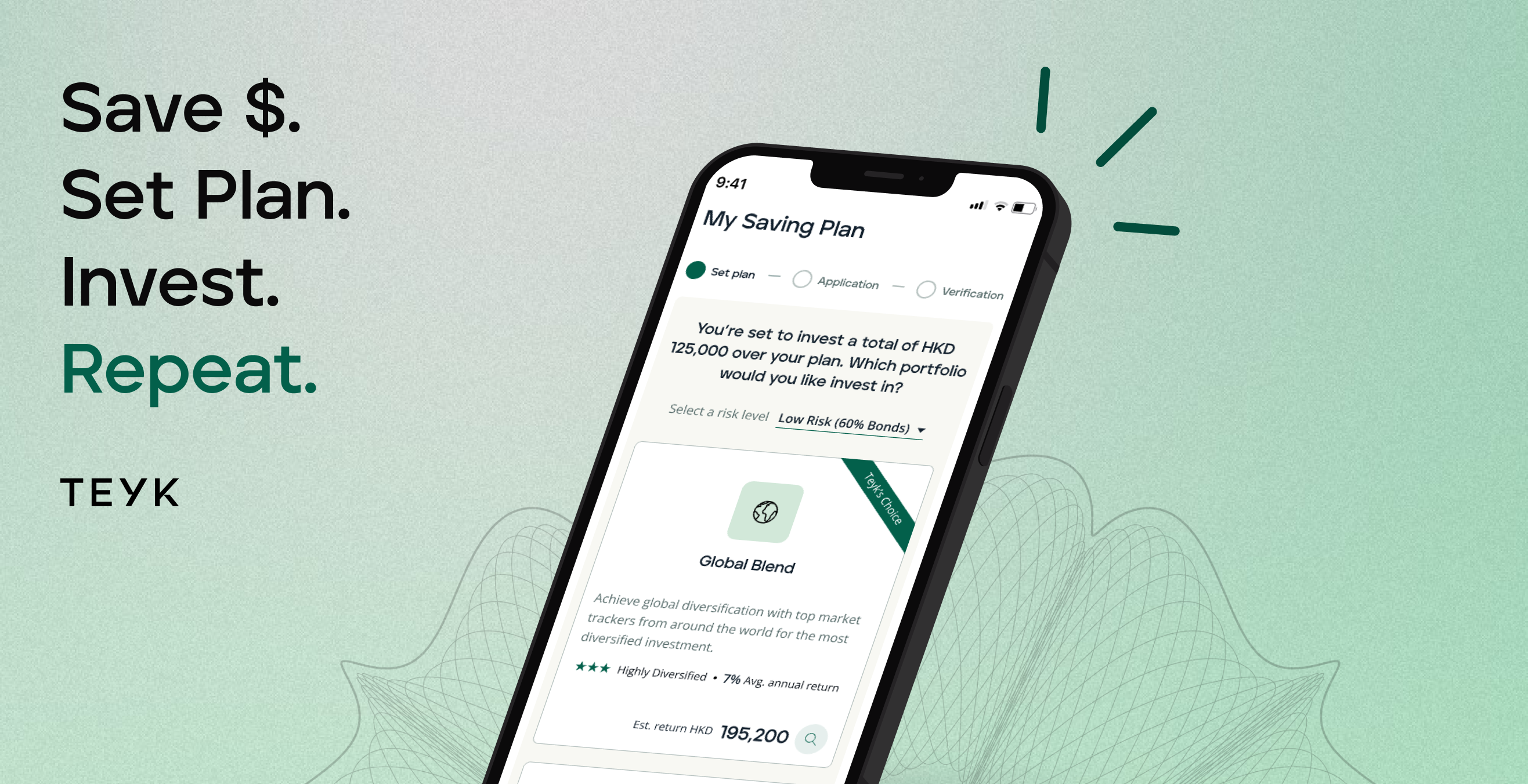
Final Designs
Looks simple. Feels like effortless investing.
Here's a detailed walkthrough of the reimagined onboarding.
Introduction of Teyk Design System
Teyk Design System is built for scalability, ensuring a seamless and consistent experience across our platform while reducing inconsistencies and technical debt. By implementing design tokens, we reduced tech debt by over 50% and increased team productivity by 30%.
With over 200 modular components, the system provides a unified and efficient UI. Beyond components, we also define vocabulary guidelines to ensure consistency in communication throughout the platform.
A design system is never static. Teyk Design System continuously evolves based on user needs, product updates, and team feedback, creating a strong foundation for the future.
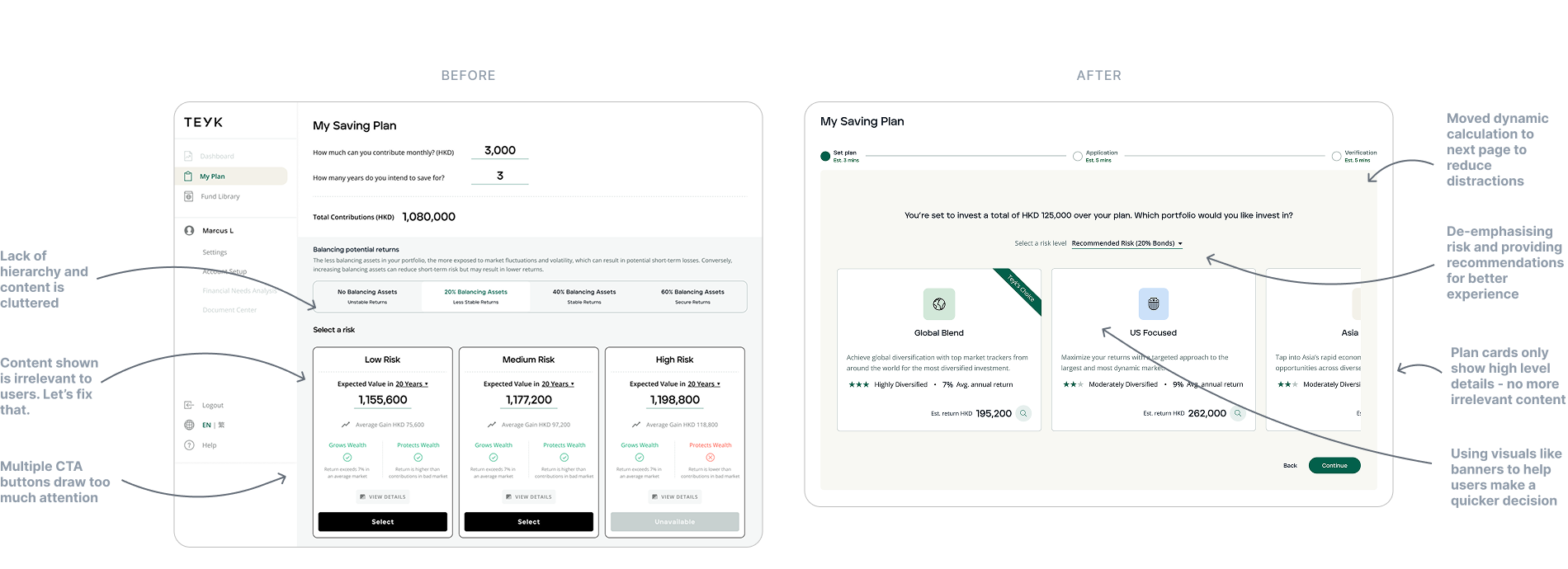
Plan simply
Less is more. By splitting the planning page into two, we helped users focus on one task at a time, reducing cognitive load and making decisions easier. Providing key details at the right moment kept distractions to a minimum. These changes expedited the planning process by 23%, helping users move through onboarding faster.

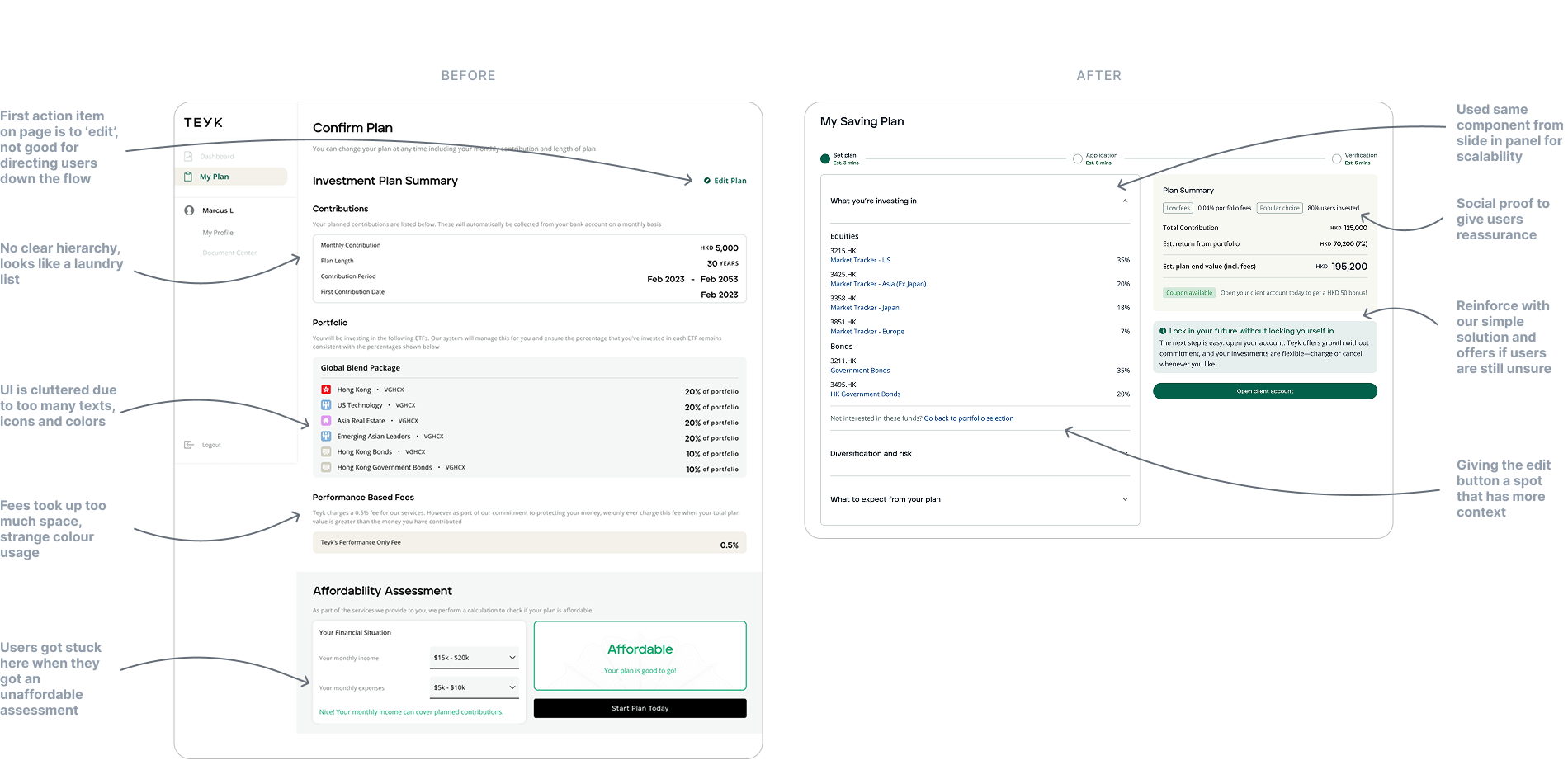
Designed for scalability: The Side Panel
With this side panel, we focused on making the complex financial details clear and easy to navigate. By breaking things down into simple, digestible pieces, we reduced cognitive load, making it easier for users to make decisions and see how each plan can fit their investment preferences.

Improved Confirmation page
To encourage users to start their plan sooner, we borrowed the familiar layout of a shopping cart. This made it easy for them to see their plan clearly while adding a sense of urgency through offers or social proof. It gave users the confidence to make a decision and pushed them to take action at the right moment.
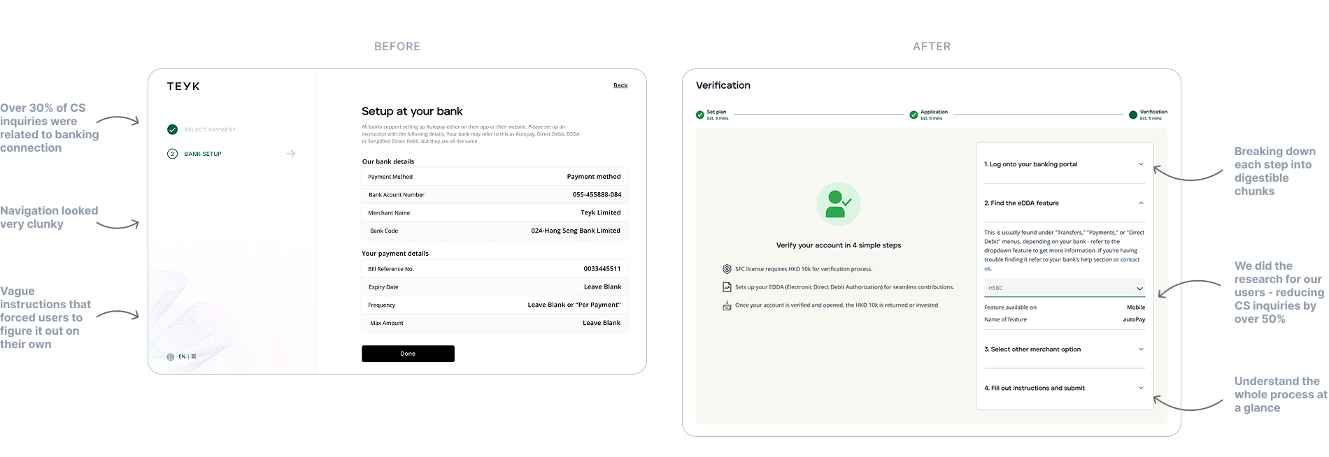
Revamped Verification instructions
We knew that sending users off our platform to an external banking app would create some friction, so we aimed to minimize it. By relying on insights from multiple customer service inquiries, we crafted simple, easy-to-follow steps that helped clarify the process. This not only made the experience smoother for users but also helped reduce future inquiries, making the entire verification process much more seamless.
Onboarding completion page
When users transferred HKD 10k, they wanted reassurance. Now, they can see who’s handling their funds and track progress in real time with automatically updating cards linked to HubSpot. It’s all about transparency and building trust.

Our takeaways
Balancing complexity with simplicity
Translating complex business requirements into a smooth, user-friendly experience was a constant challenge. We had to simplify without losing key details, ensuring users could onboard easily without confusion.
One step at a time
With limited resources and time, we had to stay focused on what truly mattered. Every decision was intentional—we avoided overcomplicating designs or chasing ideas that weren’t feasible. By taking small, strategic steps, we made sure each improvement brought us closer to our main goal without straying off course.
Making sure it all works together
Redesigning the user experience meant more than just updating the interface—it also affected internal processes. We worked closely within our small team to ensure everything ran smoothly behind the scenes (including implementing and maintaining a new design system), so the new design wasn’t just great on paper but worked seamlessly in practice.
Future
Looking beyond onboarding
Onboarding is just the start—what happens before and after matters just as much. Thinking ahead, we explored ways to personalize the user experience, from customizing the dashboard to tailoring content based on individual needs.
Details, details, details
Small bugs can turn into big problems. Even when the team was spread thin, being meticulous about every detail was crucial. A missed issue might not seem like a big deal at first—until it becomes a customer service nightmare.
Always aiming higher
Good design is never static. We're always looking to refine and improve, ensuring that future designs met high standards.
Looking back on my time at Teyk, the entire process has been an incredible learning experience. What stands out most is how the team came together to take on the role of QA, compliance and even CS team. It wasn't just about finding bugs, approving accounts and answering inquiries; it brought us even closer to the product as a whole. By taking ownership of this process, we gained a deeper understanding of the product and its intricacies, making the final design even stronger. It was a true team effort, and I’m proud of everything we accomplished together.
Thank you for reading! I hope you enjoyed learning about the process and the journey we went through. :)
More to explore

